A founder sent me five logo concepts before they owned a domain that matched any of them. The best mark sat on a name they couldn’t buy. Full disclosure: I used to push people toward “brand systems” before the URL worked. That order was backwards. Now I ask for the domain first, then we talk about a free logo that doesn’t fight the string.
If you’re pre-revenue and you need something for the site header this week, a free logo built as a tight wordmark is honest work — not a moral failure. I've shipped landers with nothing fancier than a Google Font and an SVG.
I checked Canva, Google Fonts, and favicon.io again in August 2026 for this workflow. Pair the mark with a real domain — see how to get a free domain name — and host the site with the free Pages stack when you’re ready.
Quick answer: can I make a free logo that looks credible on my domain?
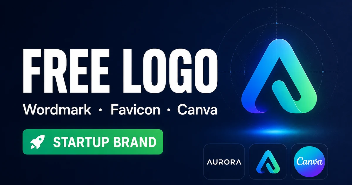
Yes — build a simple wordmark in Canva or SVG using one strong Google Font, export SVG/PNG, generate a favicon set, and place the same mark on the site that already uses your domain name.
When free tools stop matching the brand you're building, look at a curated name like AiFolio.app on DN Detector — escrow-backed, not a builder subdomain.
| Method | Cost | Own files? | Best for |
|---|---|---|---|
| Canva free wordmark | $0 | Exports you download | Fast headers and social avatars |
| Google Fonts + DIY layout | $0 | Yes | Founders who want full control |
| Simple SVG wordmark | $0 | Yes — best portability | Dev-friendly brands, crisp scaling |
| Favicon.io / RealFaviconGenerator-style tools | $0 | Icon pack | Tab icons and app touch icons |
| Hire a designer | Paid | Contract dependent | Trademarks, packaging, multi-brand systems |
Start free. Upgrade when the brand becomes a system, not a PNG in a Slack channel.
Method 1: Canva free wordmark — ship today
Canva is the path I give non-designers who need a mark before lunch. Keep it to a wordmark. Skip the 3D metallic badge templates that scream 2014.
How to make a free logo in Canva
- Create a Canva free account and start a logo-sized blank or a simple logo template you immediately gut.
- Type your domain’s brand string — the part people say out loud — not the full URL with https.
- Pick one typeface. Two fonts maximum if you insist, and the second should be quieter.
- Use two colors max at the start: one dark for text, one accent. Resist the gradient festival.
- Export PNG for the site header and SVG if Canva’s free tier allows it for your file — keep both if you can.
- Place the mark on a real page next to your domain in the address bar. If it fights the URL, simplify again.
- Save the source file somewhere durable. “Final_final_v7” folders are how logos get lost before the first hire.
Method 2: Google Fonts + a one-line brand system
Google Fonts is where I start when I want ownership without a design tool account. Pick a font with a usable license, set weights you’ll actually load, and treat typography as the logo until you need an icon.
- Browse Google Fonts and shortlist three families that match the tone — product, playful, serious.
- Test your brand string in each at large size. Some fonts murder certain letter pairs.
- Choose one family and two weights — for example regular and semibold.
- Set a simple CSS or design-tool style: size, tracking, color. Write it down so the lander and deck match.
- Create an SVG text wordmark or keep it live as web text if you want maximum sharpness.
- Load only the weights you use. Four unused italics are not a brand — they’re latency.
My take? A disciplined wordmark made from type beats a noisy icon that looks like every other AI startup mascot.
Method 3: SVG wordmark + favicon pack
SVG is the format that survives theme changes. I've redrawn more raster logos than I want to count because somebody only kept a 512px PNG.
How to finish the mark with favicons
- Create or export a clean SVG wordmark with outlined text if you need portability across machines that lack the font.
- Make a simplified mark for tiny sizes — sometimes the full wordmark fails at 16×16 and you need a monogram.
- Run the mark through a favicon generator such as favicon.io or RealFaviconGenerator-style tooling.
- Drop the generated files into your site and link them in the HTML head the generator specifies.
- Hard-refresh the browser. Favicons cache like they pay rent.
- Check the Google result preview later — search brands show favicons now, and a missing icon looks unfinished.
Deck consistency is the silent test. If the pitch PDF uses a different weight than the website header, investors may not name the problem, but they feel the sloppiness. Export once. Reuse everywhere. I've sat in calls where the only brand discussion was “why does slide one look like a different company than the URL?” You do not want that conversation.
Print is optional at pre-seed. Don’t burn budget on stickers before the domain resolves and the waitlist converts. A crisp on-screen mark beats embroidered merch for a product that still changes name every sprint.
Accessibility is part of the job too. Low-contrast gray on white might look “minimal” in a Dribbble shot and disappear on a phone in sunlight. Check contrast. Check the tab icon on a dark browser theme. Tiny details. Real users live there.
What’s not worth it
Skip AI logo mills that spit out trademark-risky symbols and claim “unlimited revisions” while locking source files behind a paywall. Skip marketplace logos that a hundred other shops already bought. Skip spending two weeks on a mascot before the domain resolves.
When is a free logo enough — and when should I hire?
A free logo is enough for waitlists, decks, and early product UI when the name is clear and you’re not filing a global trademark tomorrow.
Hire when you’re packaging physical goods, entering crowded categories with lookalike risk, or building a multi-product system that needs a real design language. I've told founders to stay free longer than their ego wanted. I've also told founders to stop iterating Canva templates and write a designer a check. Both talks felt useful.
What if my domain is strong but the free logo still looks cheap?
Usually the mark is doing too much — extra icons, shadows, and slogan lines — while the domain already carries the brand.
Strip to the wordmark. Match letter case to how you say the name. Put it on a quiet background. Then look again. Most “cheap” feelings are clutter, not the absence of a $5k invoice. If the domain itself is the weak link, browse premium domains before you commission illustration.
Color systems should stay boring on purpose. One near-black, one accent pulled from a calm palette, optional soft gray for secondary text. I've watched founders burn a week picking teal variants while the waitlist form still 404'd. Ship the form. The teal can wait.
Social avatars are where early marks often die. A wide wordmark that looks perfect in the site header becomes an unreadable smear as a circle crop. Make a square monogram version — first letter or two — and use that for Twitter/X, LinkedIn, and Discord. Same family, different crop. That's still a complete free logo system, just honest about surfaces.
File hygiene matters more than people admit. Keep SVG masters, PNG exports at 2x, and a one-line note about the hex codes. When a contractor asks for “the logo,” you should not be digging through iMessage. I've been that contractor. I've also been the founder who only had a screenshot from a pitch deck. Neither role is fun.
If you're comparing a coined domain that already reads like a mark, sometimes the best treatment is restrained type spelling the string exactly. No icon. No swoosh. The domain does the memorable work — which is why I care about the name before the illustration.
Host the site that carries the mark with our guide to host a website for free, and keep hello@ aligned via free business email. For an AI product brandable that already looks like a logo in text form, check Aifolio.app — sometimes the string is the design system. Process questions live in the FAQ; naming hygiene tools sit on domain tools.
My close: make the free logo quiet enough that the domain can talk. Ship the header. Talk to users. Redesign when the story changes — not when a template site tells you that you’re incomplete.